
Visual System &
Components
Create a consistent visual language that makes the municipal website easier to recognize, understand, and maintain.
Why it Matters
Consistency helps people understand how information is organized and what actions they can take. A clear visual system can also reduce design decisions for staff, strengthen municipal identity, and make it easier to maintain a cohesive experience as the website grows.
Do pages and online services use consistent navigation, labels, buttons and forms?
When it's working well
Pages and connected services use the same navigation, labels, buttons and form styles. Staff build pages from shared templates, so new pages match existing ones. Connected services carry the same branding and link back clearly.
A quick win
Create templates for your three most common page types, such as a service page, a program page and a notice. Write a one-page guide to headings, labels, buttons and forms. Ask the vendors of connected services to apply your colours and logo, with a clear link back to your website.
Ideas that help
Visual Hierarchy & Content Presentation
APPROACH
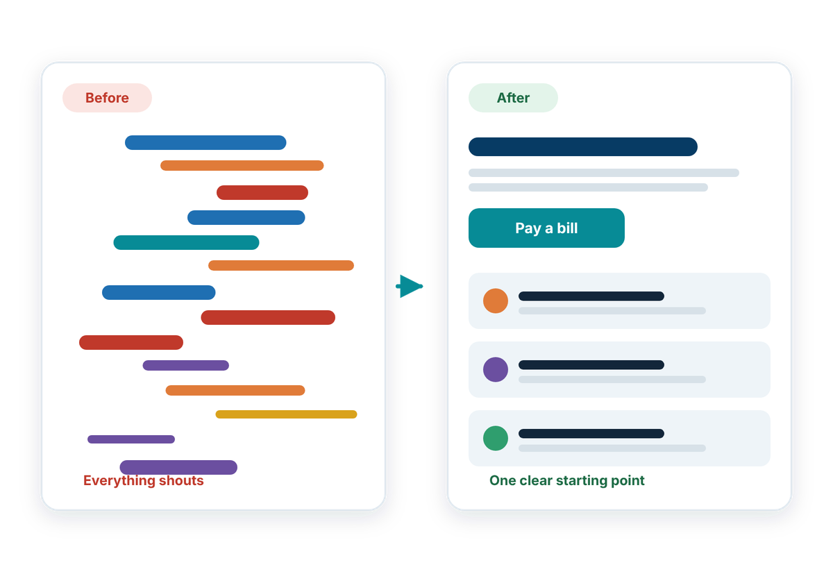
Make important information easier to scan, understand, and act on.
Even well-written content can become difficult to use when everything has the same visual weight. Clear headings, spacing, summaries, cards, lists, and calls-to-action can help people quickly understand what matters, where to look next, and what action they can take.
Content presentation should:
Foundations
Brand & Visual Identity
FOUNDATION
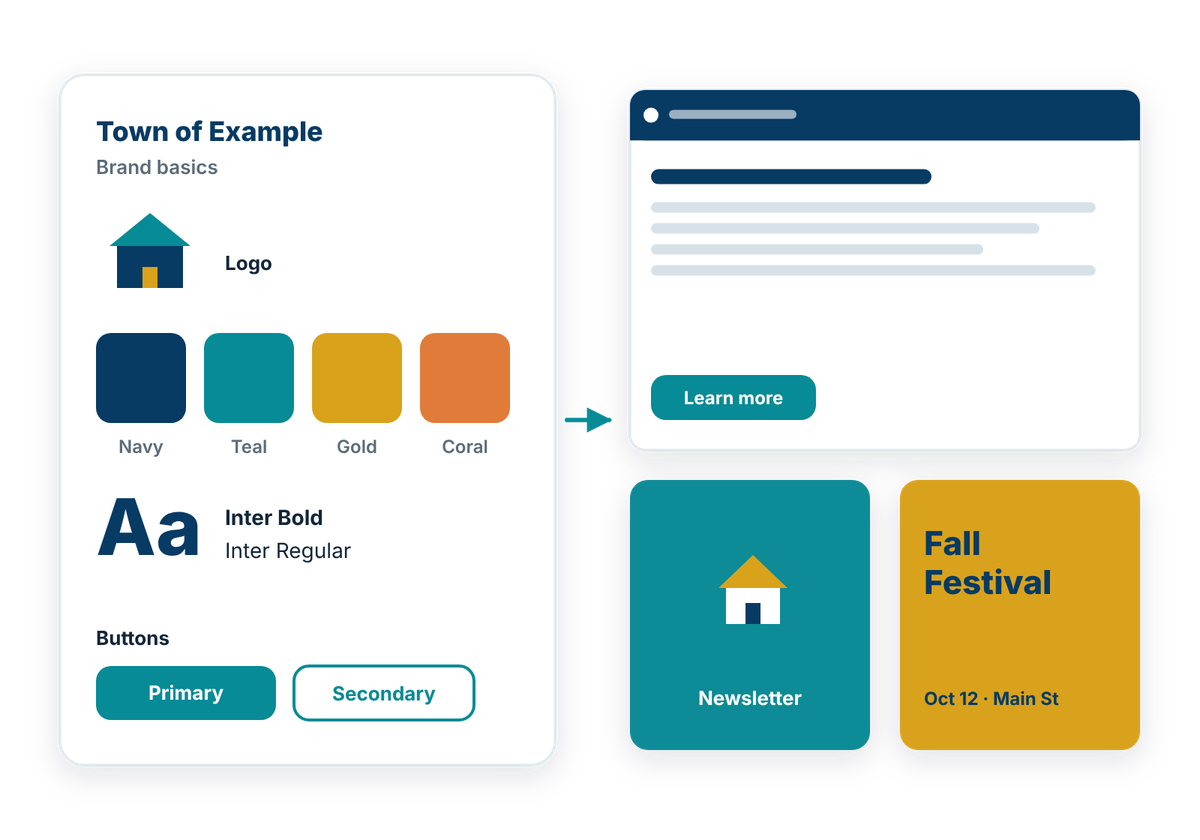
Create a recognizable digital experience that reflects the municipality’s identity across the website.
A consistent visual system helps different departments, services, and content types feel like part of the same organization. Clear rules for colour, typography, imagery, and partner branding can make the website feel more cohesive without making every page look identical.
A visual identity system should:
Templates & Reusable Components
FOUNDATION
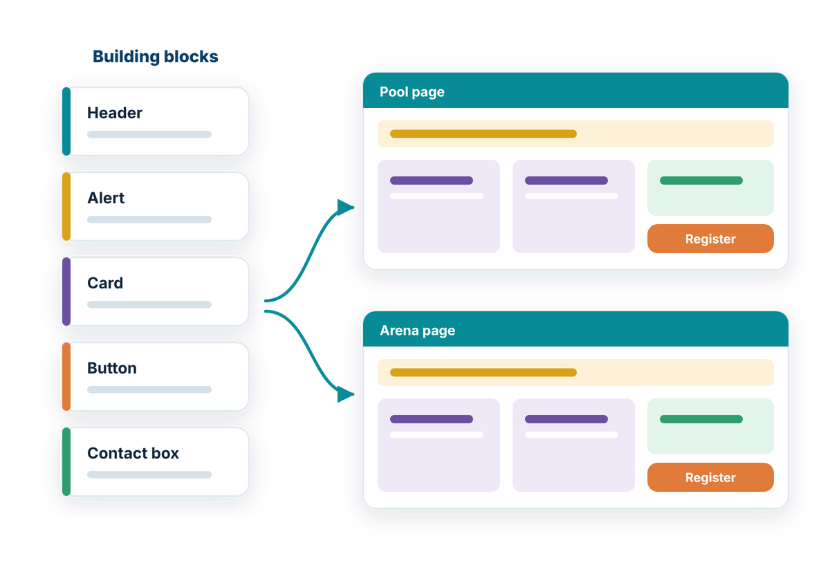
Create repeatable building blocks that make the website more consistent and easier to maintain.
Municipal websites contain many recurring content patterns, from service pages and alerts to cards, calls-to-action, and related links. Reusable templates and components can help staff create new content more quickly while keeping structure, styling, and interaction patterns consistent across the site.
Reusable components should:
Also consider
- Accessibility & Readability: clear headings, good contrast and consistent presentation that work for everyone.
How well does your website work for residents?
Take the free check-up. In about 20 minutes you'll walk through everyday situations, like reporting a pothole or finding a council agenda, and get a plain-language check-up report of what's working and what to tackle first.